GUI
Visionary Render permits you to add bespoke user interfaces to your scenes. These can be simple non-interactive visuals for company branding or more complex controls for interacting with your scene.
GUI Containers
To create a GUI container, open the Developer tree, then right-click on Scenes and select Create > GUI Containers from the context menu. There are 3 types of container: Billboard, GUI, and Marker.
Billboard
Billboards can be used to move or size your GUI with the view, and are often used as a base layer (although GUI items can also be attached to regular Assemblies). They are not solely tied to GUI items and can also be applied to Assembly nodes with Models.
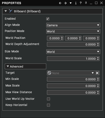
The billboard on its own isn’t visible in the scene and requires further GUI assemblies before its behaviour can be seen.

Typically this would start with a GUI, Stack and Button. Once these are created, we can start to look at the Billboard properties. As with all assemblies, the billboard can be enabled and disabled via the Properties window.
Align Mode
The align mode and position mode are interlinked and determine how a billboard is aligned and where it is positioned in world or screen space. Align has 3 options: World, Screen, and Camera. The Camera align has three sub categories.
By mixing and matching settings, GUI’s can be created as Head Up Displays (HUD), fixed GUI’s in a 3D scene or world positioned aligned GUI’s. Alignment choice is down to what sort of interface you wish for.
| Mode | Description |
|---|---|
| World | World aligned will position a billboard in the 3D scene. You will be able to rotate around this and can see the back of the button. This uses the parent object world rotation, so the Billboard can be attached to an object and rotated within the 3D scene. |
| Camera | Camera aligned will always rotate the billboard to face the camera. |
| Screen | Screen aligned will appear flat on the screen no matter how you rotate in the 3D scene. |
| Camera X, Y, Z | These three sub categories will rotate the billboard to the camera but will lock X, Y or Z axis. |
Position Mode
| Mode | Description |
|---|---|
| World | World Positioned will place the billboard in world coordinates in the 3D scene |
| View | View Positioned will place the billboard at a fixed distance from the viewer in meters. Generally, this is used when tracked. If you want a billboard positioned relative to your head, use view mode. |
| Screen | Screen Positioned will place the billboard on the screen at the coordinates entered. The range is from -1 to +1 with the centre of the screen being at 0, 0. |
Once the position mode is selected, the position of the GUI can be adjusted with the X, Y, Z values. The World position mode includes a setting offset the billboard towards or away from the camera.
Size Mode
The alignment and position modes generally determine the size mode. If using a World aligned, World Positioned billboard, you will usually set the size mode as World and scale appropriately.
If using Screen aligned, Screen positioned, you will use either View or Pixel size. Pixel size can cause problems when switching between differing resolution monitors or projectors whereas View is relative to the screen.
Examples
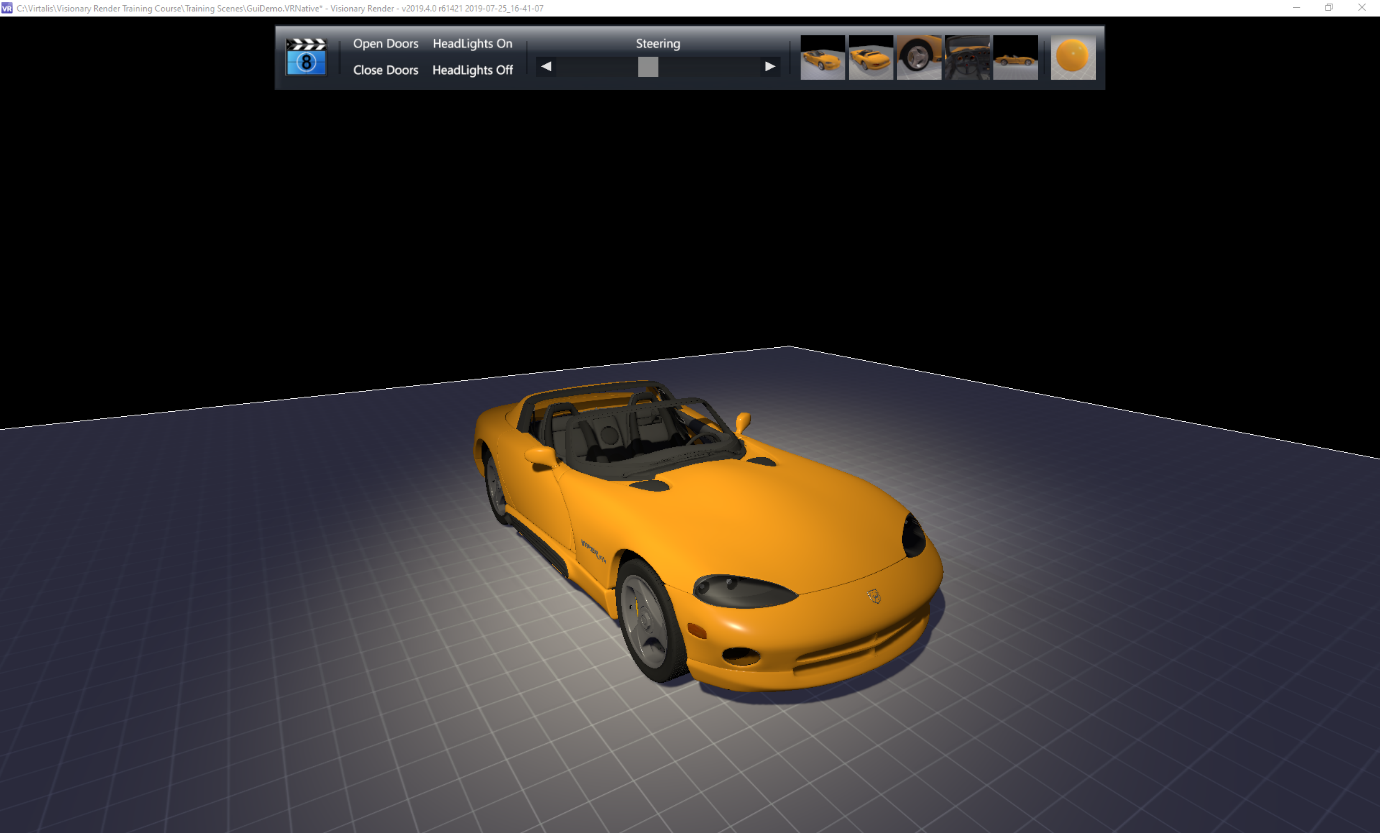
Screen Aligned, Screen Positioned:
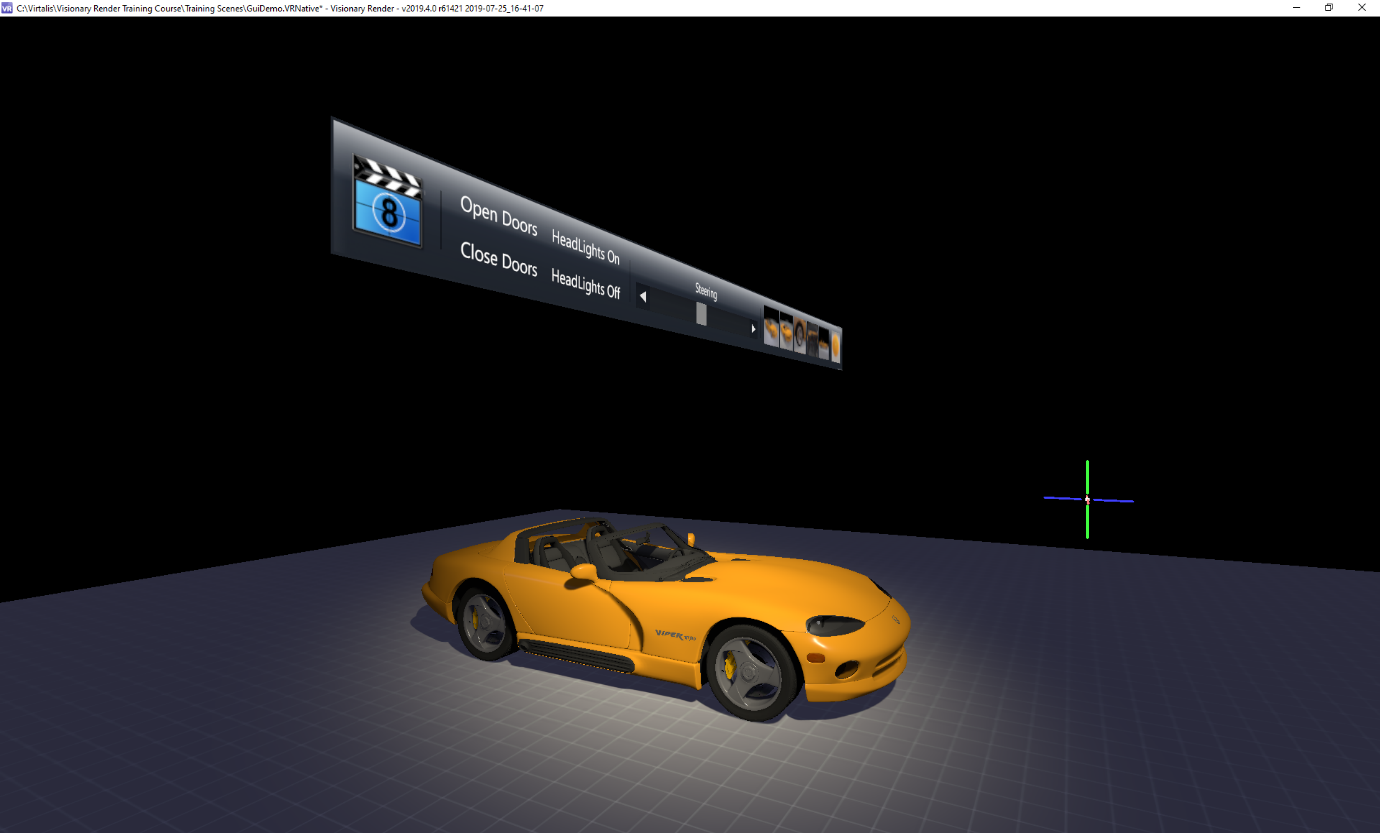
World Aligned, View Positioned:
Camera Around Y Aligned, World Positioned:
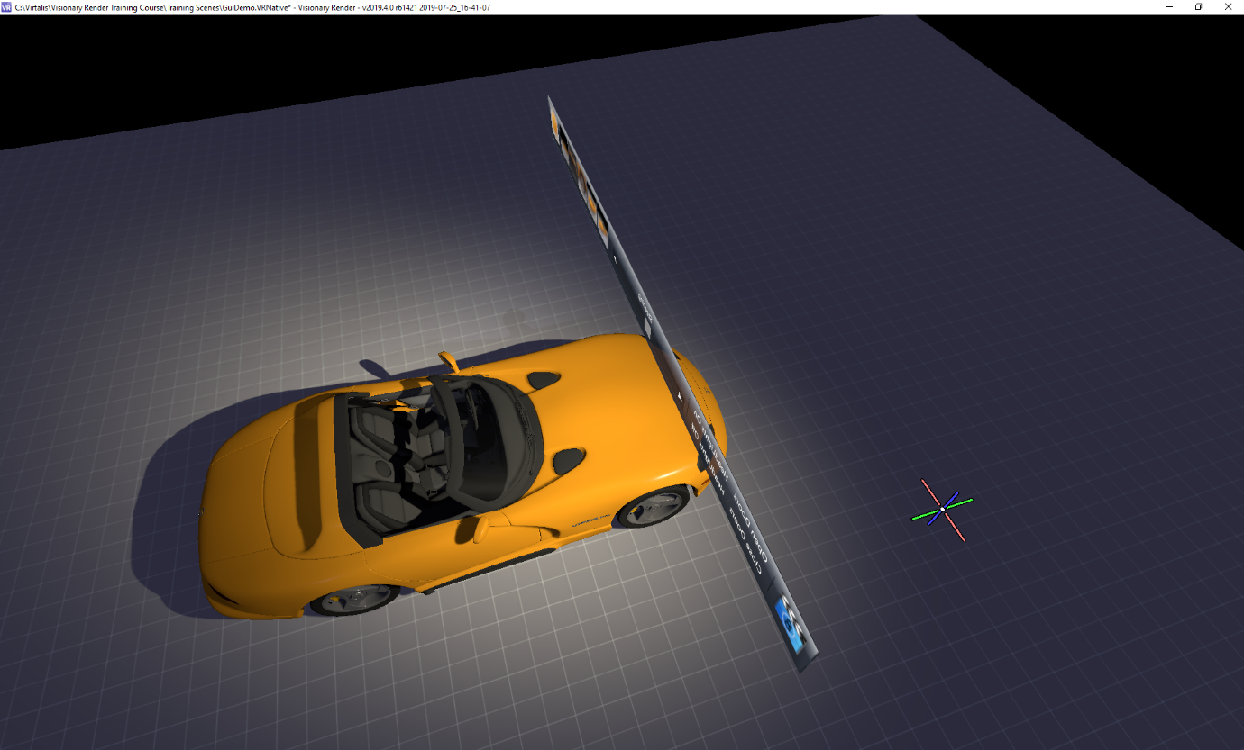
Adjusting these settings will allow you to create GUI’s that are positioned in a world scene such as a touch screen panel in the 3d scene or as a HUD display that is always visible etc.
GUI
The GUI node is a container for other GUI items. Layer, Depth Write and Depth Test determine the depth at which the GUI is drawn within a scene.
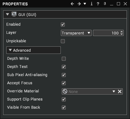
Within a 3D scene, different layers are drawn at different depth layers. The easy way to think of it is like a stack of pages with higher number pages overlaying lower numbers. The large value allows for numerous assemblies to be layered without conflicting. If set low i.e. 1000, the GUI will be drawn behind scene objects. By default, the GUI is created at 300,000. The predefined layers are set at:
| Opaque = 100000 | Transparent = 300000 | Scene Overlay = 390000 | View Overlay = 400000 |
|---|
Each layer can have an offset to differentiate between the default layers. Unpickable makes the GUI unselectable using the mouse or 3D cursor. This would most likely be used to create logo’s, watermarks or can be used to retain the GUI on screen whilst stopping interaction with it until a set condition was reached.
By checking the Depth Test, the GUI assembly will use the Billboard Z position to determine if a 3D object is drawn in front of it. In this example, the GUI Z position is set at 2 meters away. When the viewpoint nears the car, it intersects with the car model.
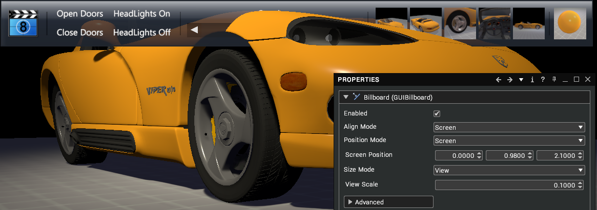
Depth write will allow that GUI to obscure other things, i.e. if there’s something else drawn later but behind the GUI, you’ll need the depth write option turned on to stop it drawing over the GUI. In general use, the HUD GUI’s will have depth test and depth write set to off.
Sub Pixel anti alias is a rendering technique that improves Font clarity on LCD displays. By default this will be set to on.
Accept focus is used to take keyboard input. With accept focus on, you can click on the GUI and any keys you press will be directed to that instead of triggering events in the scene. For example, you may wish to use the arrow keys in a GUI to select between different options. With accept focus off, the arrow keys will still control the camera and will turn the 3D scene. With it turned on and the GUI selected, the arrow keys won’t move the 3D scene.
Support Clip Planes is enabled by default and determines whether dynamic sections should clip the GUI.
Visible From Back is enabled by default and determines whether the GUI is visible from the back as well as the front.
Marker
Markers are an element of GUI’s that are used in the 3D scene.
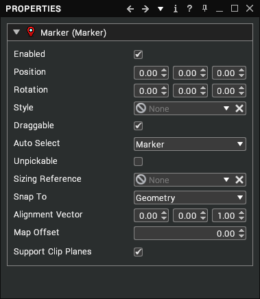
By default, a spherical marker is added to the scene at 0,0,0. This can be moved around the scene. If draggable is enabled, the marker can be moved with the left mouse but uses the snap to selection to determine the marker position.
Auto Select determines whether the selection is off, the marker itself, its parent assembly or the linked assembly specified by the AutoSelectLink. Alignment Vector, Map Offset and Sizing Reference are based on Style options.
Support Clip Planes is enabled by default and determines whether dynamic sections should clip the marker.
GUI Items
To create a GUI item, you must first have a GUI node in your scene. Open the Developer tree, then right-click on Scenes and select Create > GUI Containers > GUI from the context menu. Now right-click on the GUI node and choose Create > GUI Items from the context menu.
Common Properties
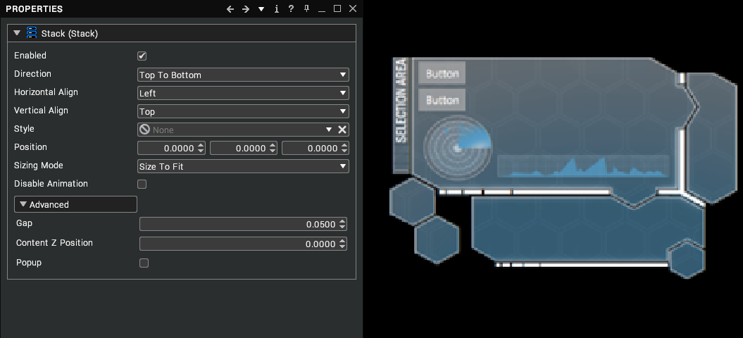
There are a few properties that apply to most GUI items and these cover position, size, and style. The following is from the stack item, but the core values can be found in most GUI items.
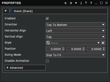
In most situations, the position should be controlled by the Billboard with the Stack position being used when you are creating multiple Stacks in the same GUI. The sizing mode determines how the GUI items fit within the stack.
| Mode | Description |
|---|---|
| Fixed | Uses exact values for X and Y. If GUI items don’t fit within this area, they may overlap with each other and the stack edge. |
| Size To Fit | Will adjust the X and Y size to fit to the largest GUI item within the stack. |
| Fit X | Will adjust to fit the largest GUI item X size. |
| Fit Y | Will adjust to fit the largest GUI item Y size. |
Panel
Panels are used as holding assemblies for GUI items when you don’t want to have automatic alignment. A style can be applied that creates a background image for GUI item placement.
Stack
The key assembly is the Stack. This provides a layout for buttons, images etc. Whilst not required, if GUI items are created without a stack, they all appear on top of each other. They can be moved into position but the stack eliminates the need by auto aligning GUI items. The size and appearance of the stack will be linked to the Direction.
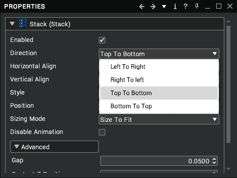
The four options dictate how the GUI items will line up with each other. These are based on the order they appear in the scene tree.
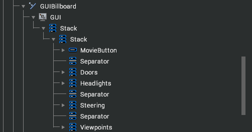
In this example, with left to right, the button order will start with the Movie button on the left and the Viewpoints on the right. If switched to right to left, the order will change with the Viewpoints on the left and Movie on the right, etc.
As with all assemblies, the order can be adjusted by dragging the GUI item in the scenes tree to the new position. Stacks can be added to an existing Stack. This is used when you wish to have both vertical and horizontal stacks of buttons.
In this example, the Doors, Headlights and Steering use Top Bottom Direction stacks within the main left to right Direction used on the GUI stack.

Both Horizontal and Vertical align modes follow the same approach just using differing axis.
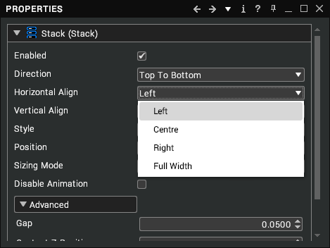
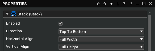
The first three options are self-explanatory with the final option of Full Width or Height ensuring that GUI items will fill the available space. The difference between centre and Full Width can be seen below with a full width slider and buttons.

By default, the stack adds GUI items with gap in between each item to distinguish between them easily. This can be varied to increase spacing, remove spacing or even overlap GUI items.
The final positional property for stacks is for the Content Z position. This is rarely used but in certain configurations of GUI, there can be times when the GUI items are “Z fighting”. This is a term used when two or more objects occupy the same position and the graphics card cannot decide which to draw first. What occurs in this situation is seen as flickering between the two faces. If this occurs in the GUI, you can move the Z position of the contents forward so that it is no longer on the same plane as the GUI stack.
The final two properties define the style of a button and toggle popup/hide the GUI as an animated visual.
Rollout Stack
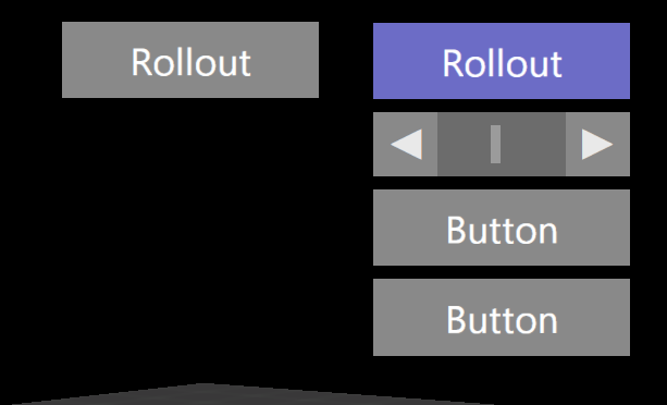
The rollout stack is a variation on the base stack GUI item. The additional part is that a header button is created that when pressed will expand to show the child buttons/sliders, etc. The image below shows two vertical rollouts, one closed, the other expanded.
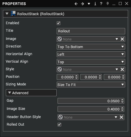
Additional properties to the normal stack are for the rollout Title and header button style.
Buffered Stack
The buffered stack and scrolling stack work in a similar manner to normal stacks but the main difference between them is that all GUI items under stacks are rendered to a texture that is used as the GUI. Both have additional properties that determine the quality of the GUI visual. The key property is the Resolution. This is the size of the image rendered. Adjust this until the text or images are clear and not blurred. Mipmapping will only be used when the GUI is in world space rather than a HUD based GUI.
The buffered stack works in the same manner as the standard stack. If creating a world space GUI, the normal stack can sometimes flicker when fine lines are seen at a distance. The buffered stack gets around this by writing into a texture and using mipmapping to reduce any flicker effect.
Scrolling Stack
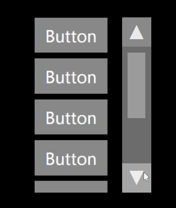
The scrolling stack uses the standard scroll bar approach to place multiple buttons within a small space by allowing them to scroll either vertically, horizontally or even both directions.
Button
The button item is probably one of the main GUI items that will be used for triggering events in a scene. If a single button is all that is required, then the button can be added directly under the GUI assembly but for more than one, it is generally better practice to add under a stack item.
Buttons appear with a default style and the text Button. These can be changed in the properties window. Altering the Text will alter the button text.

If an image button is preferred, deleting the text will create a blank button that an image file can be added to or both text and image can be used. Any texture can be dragged into the link to apply to the button.


The default style applied to a button has a small image style applied so to create a button that is just an image will require creating or adding a new button style.
Toggle and Toggled are linked together. The toggle flag states that the button will toggle, and the toggled flag shows the state of the toggle. The default button style will turn a violet colour when it’s clicked and will revert to grey on a second click. You will see when the button is clicked the first time that the Toggled flag is enabled.

This could be used to toggle the visibility of a model or toggle a dynamic section etc. It is possible to change the text using Lua script when toggling between on and off.
The Radio Group is created so that only one member of its group can be toggled at once. For example, in a chess match, when one player stops their clock, the other players begins and vice versa. In this scenario, the radio group would allow only one players clock to be running at any time so effectively when one button is turned on, the other is turned off. Groups are created in the Developer tab in the Libraries node.
Once a Button group is created, it can be dragged into the Radio Group link. No matter how many buttons are included in this group, only one can be toggled at any time. The tool tip allows you to add additional information to a button in the form of a tooltip popup.

Label
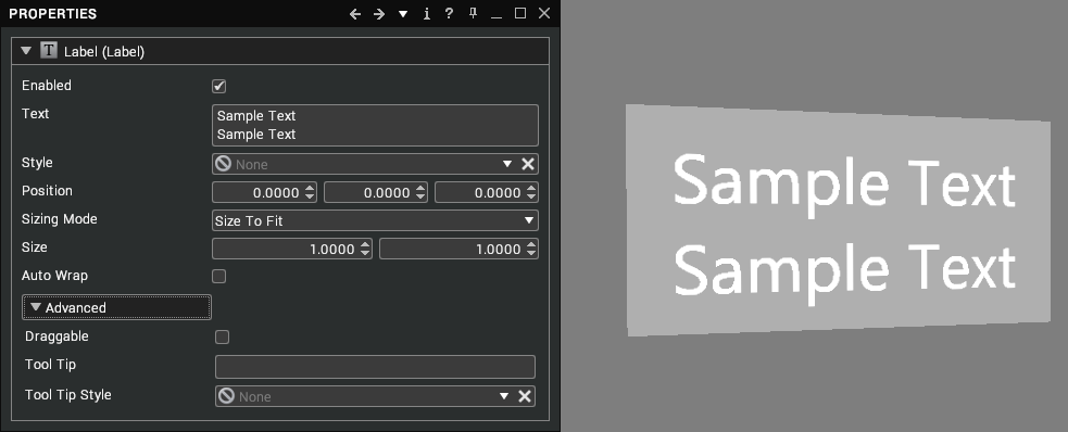
A label permits you to add text to your GUI – simply change the Text property and press Enter to view your text in the scene. To change the appearance of the label, drag a ColouredLabelStyle or TexturedLabelStyle node into the Style property.
Text Box
Text boxes are basically an editable label - i.e. you can click on them in the scene and edit the text that is shown.

Usage
- Left-click in the text box to place the cursor there and permit keyboard input.
- Left-click + drag to highlight the text.
- Press
Enterto insert a new line of text when the Multiline property is enabled. - Double-click on a word to highlight it.
- Press Tab to move focus to the next textbox in the tree.
Properties
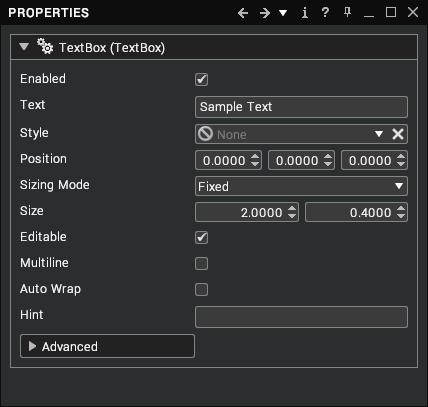
| Property | Description |
|---|---|
| Enabled | Draw this text box in the scene. [default: true] |
| Text | The text displayed within the text box. [default: none] |
| Style | The style used to draw this text box (accepts label styles). [default: none] |
| Position | Position of the text box relative to its parent. [default: 0, 0, 0] |
| Sizing Mode | How the text box is resized. There are 4 options: - Fixed [default] - Size To Fit - Fit X - Fit Y |
| Size | The size of the text box, used for fixed sizing modes and for text wrapping. [default: 2.0, 0.4] |
| Editable | Whether the text can be edited in the 3D scene. [default: true] |
| Multiline | Whether new lines can be added when editing the text in the 3D scene. [default: false] |
| Auto Wrap | Controls whether the text is automatically wrapped onto new lines when its width exceeds the specified size. [default: false] |
| Hint | Alternative text to be displayed when the text box is empty. [default: none] |
Separator
Separators are designed to provide a delineator between GUI items. They take the form of a vertical or horizontal bar of a specified colour.

With vertical and horizontal separators, the parent stack should be set to full height or full width.
Tree View Item
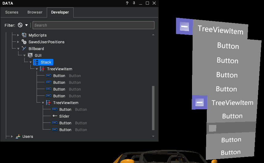
TreeViewItem are expandable menus based on the standard +/- tree structure. This could be used when complex menu systems are required. Expanded items can contain any GUI items. The treeview item can be layered to create several expandable tree structures.
Slider
Sliders provide a GUI item that can be dragged between two numbered values. A common use would be to link the slider position with a sequence position. This could be used to animate doors opening, dissassembling parts, etc. and could be controlled by moving the slider. This requires some basic Lua script.
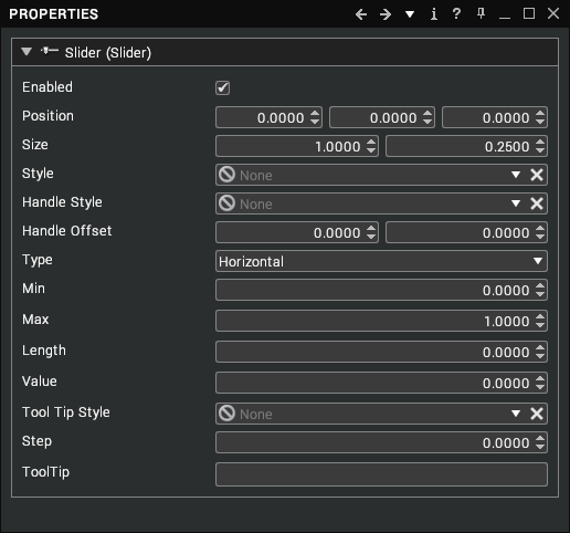
The key properties of the slider are the min / max and value. These determine the range of the slider and the current position.
The type specifies whether the slider is moved horizontally or vertically and the Length specifies the size of the slider handle. As the min/max range is increased the handle will become smaller and may require increasing in length. The difference can be seen below.
When a range is specified, always increase the Maximum value by the length of the handle. This ensures that the slider can be dragged to the full required range. In the top example above, if the slider maximun was set to 1, the slider value would only move from 0 to 0.9 due to the 0.1 length of the handle.
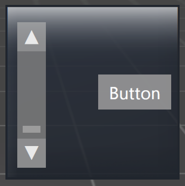
Scroll Bar
The scrollbar behaves the same as a slider but also has arrow buttons that adjust the handle position.
Image Panel
Image panels can be used to create enhanced GUI’s by adding background visual elements. In this example,image panels are added to a stack. The background could be created as a style and applied to a stack but the image panel provides additional versatility in placing visual elements.
GUI Resources
To create a GUI resource, open the Developer tree, then right-click on Libraries and select Create > GUI Resources from the context menu.
Styles
All GUI items are created with a default style. Depending on the item, it will vary but for example, the button default style has a standard colour, text colour, mouse hovering colour, toggled colour, etc.
Some example styles are in the Gallery and can be dragged into the style link to alter the appearance of GUI items. New styles can be created to reflect company colours and fonts, etc.
Styles are generally self-explanatory and use similar properties when defining. The properties are generally broken down into colour, border size, texture, font, and position.
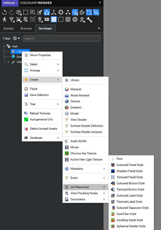
The resource type is again self-explanatory as in Coloured, Gradient and Textured Panel Styles all apply to Panel GUI items etc. To apply a style, drag and drop the created style or pre-created system style into the style link for the GUI item, or use the link control dropdown to create a style suitable for the control being edited.
Font
Fonts are added to styles by dragging the link into the created style. When adding a font, enter the name of the font into the Typeface box then choose a point size, weight, italic and width for it.
Coloured Panel Style
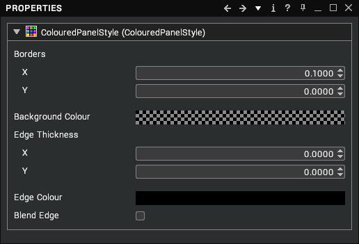
The coloured panel provides styling for controls such as panels and stacks. It provides controls for background colour, borders (interior padding), and colourful edges.
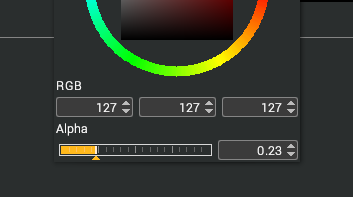
The opacity level is at the bottom of the wheel and allows for semi-transparent GUI items.
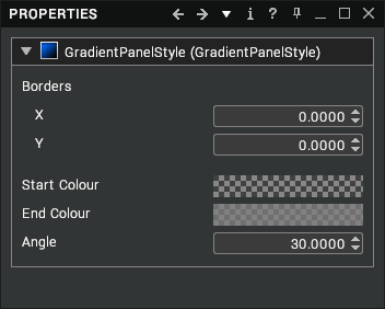
Gradient Panel Style
The gradient panel style uses two colours and an angle to generate a gradient across the panel.
Textured Panel Style
Texture Panel styles provide the ability to add a texture to a Panel GUI item. The position and size properties give control over the placement of the texture which lets you use repeating textures or just part of an image.
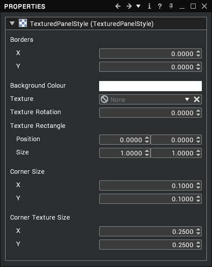
The corner properties are used when a square texture is applied to a non-square panel. Adjusting the corner size will move the edges inwards whilst the corner texture size stretches the corners of the texture to fit the corner space. On the left you can see the corner corrected version whilst the right shows the squashed square to non-square version.

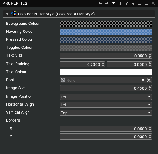
Coloured Button Style
The coloured button style provides simple colour options to distinguish between normal, hovering (mouse over), pressed and toggled. The font colour, type and size can be controlled as well as image size, alignment and position.
Textured Button Style
Textured buttons may initially look overly complex, but the core properties remain the same allowing you to select font, size alignment etc. The four modes are still present for normal, hovering, pressed and toggled but are now covered by textures. The textures can be four separate textures or using the position and size properties can be a single texture split into different quadrants. Using the following texture, the size can be set to 0.5 and position adjusted so that a single texture can be used for all four button states.
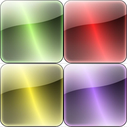
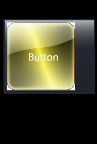
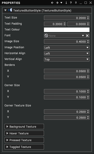
Using the above texture is fine when the buttons are square but if the GUI button is rectangular the texture would appear squashed. To adjust for this, we can alter the Corner properties to move the corner inwards and stretch the texture to fill the area.
Coloured Label Style
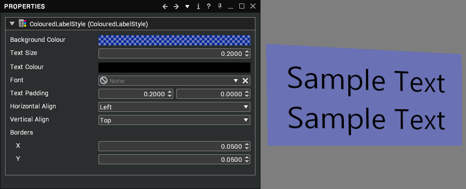
A ColouredLabelStyle permits you to configure the background colour, text size, text colour, and font applied to labels. To apply it to a label, drag the ColouredLabelStyle node from the tree into the Style property of that label.
Textured Label Style
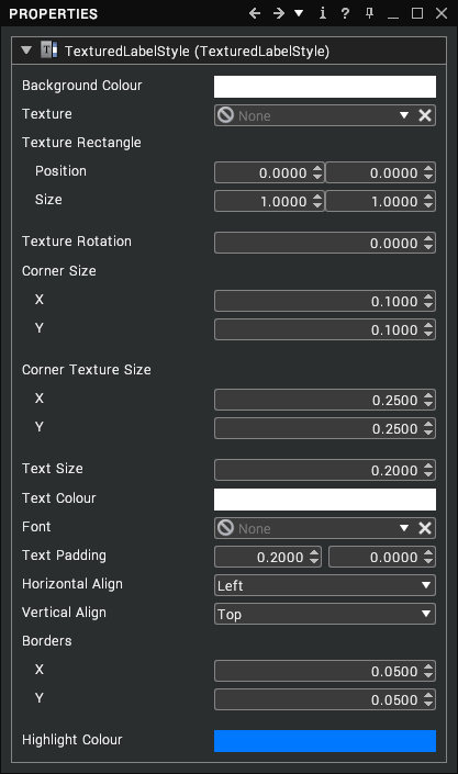
A TexturedLabelStyle permits you to apply textures to the backgrounds of labels. You can also configure the text size, text colour and font. To apply it to a label, drag the TexturedLabelStyle node from the tree into the Style property of that label.
Coloured Separator Style
The coloured separator sets the colour, thickness and border size for the separator GUI item.
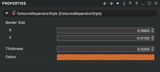
Scroll Bar Style
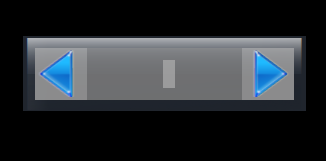
Scrollbar styles use a mixture of styles and textures to define an overall look.
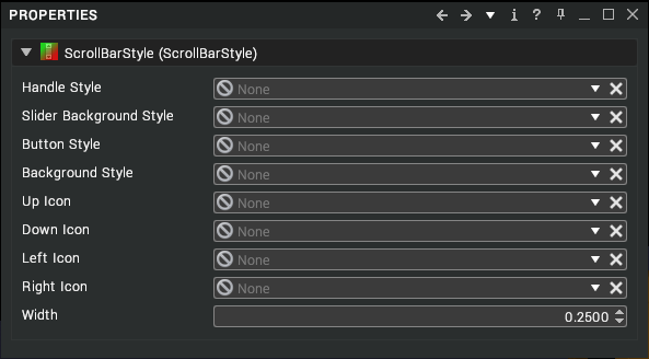
Style links left blank will use the default settings.
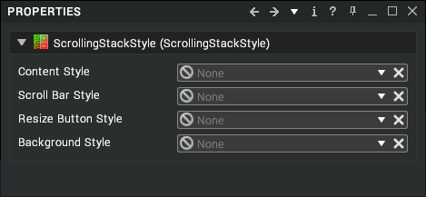
Scrolling Stack Style
The scrolling stack style uses a selection of styles to create an overall style.
Spherical Marker Style
The spherical marker style adjusts how the default marker is displayed in the scene.
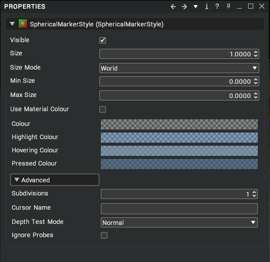
As with other GUI styles, colours can be adjusted for base colour, highlight, hovering and pressed. The main settings are for size. World size is default and retains the specified size within the scene. If View or Pixels are set, the marker will adjust its size as you move further away from the marker.
With View set, you can specify a minimum and maximum size that the marker will appear on screen.
Model Marker Style
Model marker style allow you to replace the default spherical marker with a 3D model.
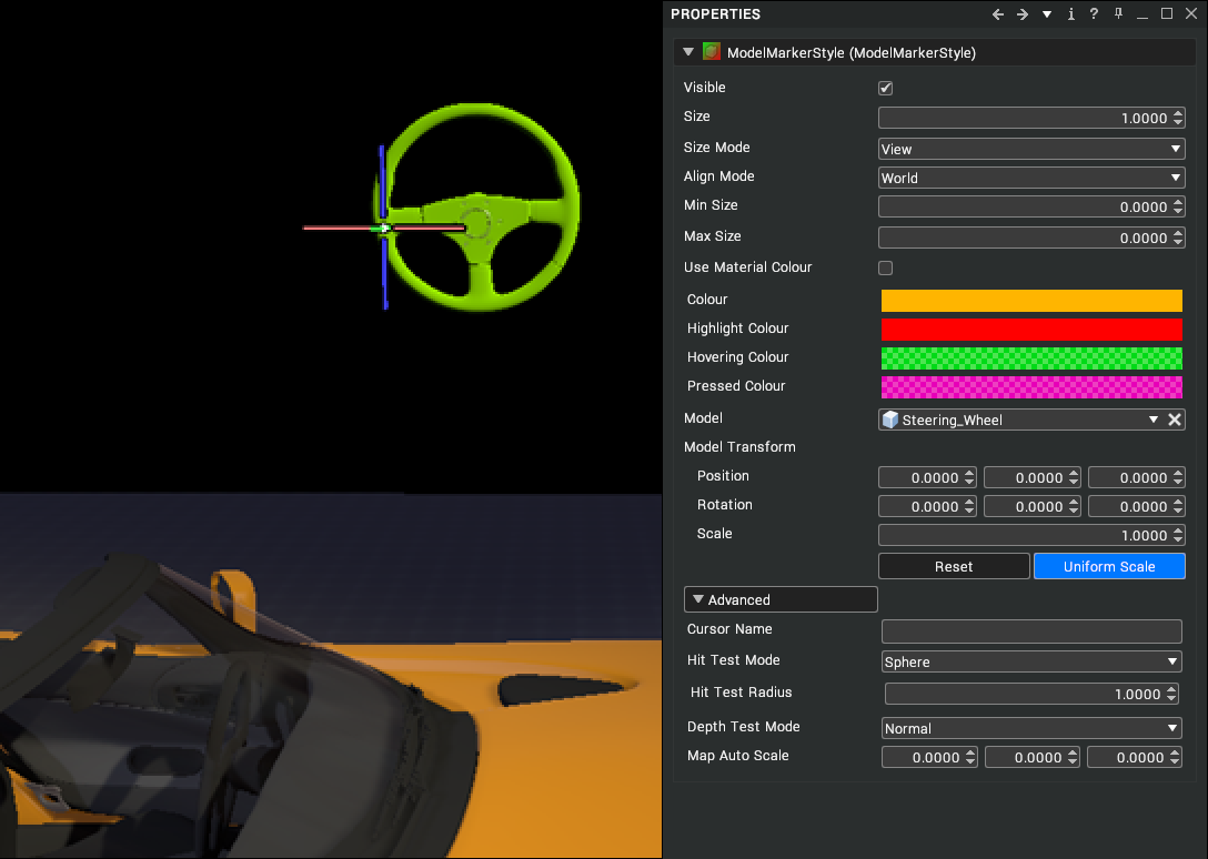
As with spherical marker, the size and colour are defined in the style. The main property is the Model link. Drag and drop a model from the library into the link box. This will replace the spherical marker in the scene.
Image Marker Style
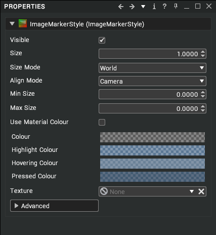
The image marker style controls how the default sphere marker is displayed in the scene. It provides the same properties as the spherical marker style, with the addition of a Texture property to apply an image to the marker and an Offset property to adjust the location of that image.
GUI Material
The GUI material is an unlit material used for the GUI item. If no other styles are defined, this will apply to all GUI items. Note that Button style may add a level of transparency that makes the texture less visible. To adjust, create a button style with less opacity.
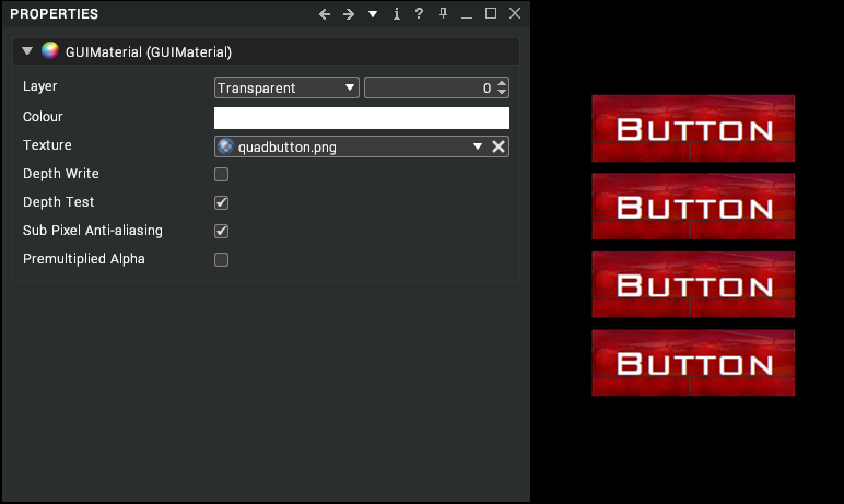
A variety of styles and menus can be created using the available options. Whether creating corporate identities or stylised interfaces the menu system can be tailored and scripted to provide a versatile GUI.
Button Group
It has no properties of its own but is used to ensure that only one button at a time is toggled in a group of buttons.